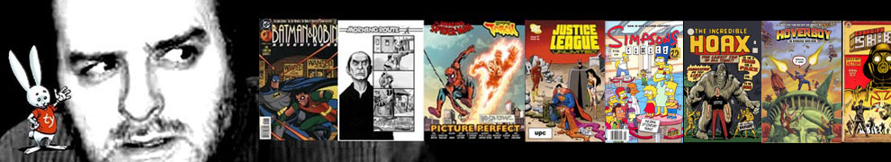
Ol’ Batman has been hovering around my drawing board this week, as I’m doing portraits of Bob Kane and Bill Finger all day long for the Finger project. But since I’m rummaging through the Gotham City wing of my studio anyway, I dug out some unused designs sketches for past Batman Adventures covers that were cruelly rejected…and since I’ve been encouraged to toss these unseen bits of nonsense up on the blog in the past, I’m going to do just that, because that’s my way. If people like it, this may be the first of many such posts.

These thumbnails were for Batman And Robin Adventures #7. I don’t recall why these first two ideas were turned back. It might be that Batman was too small on either of them…
 Or it might have been the live gunfire, or smoking guns on the covers, I do recall that the policy about guns was pretty strict.
 Unless you were pointing the gun at a wooden puppet, then it was okay. Still they rejected this one as well, but I do recall that I was encouraged to go back to this theme and try another angle of this idea. Aiming the gun at the puppet was fine.
 The final sketch that was approved. This might have been the first of many covers editor Scott Peterson said yes to, that didn’t have Batman on them at all. As I look over the run of many dozens of issues, it’s odd how many don’t have Batman on the cover. I love that openness in an editor.
 You’ll notice how little changed from the original little sketch to the final art. I was so happy with the big bold lines on the sketch (originally three and half inches by five inches high!), that I blew it up and light-tabled it at 10 x 15. That was a pretty common trick for me, to keep the simple look of the designs.
So do you agree with the editor? Did we do the right one?
Ty the Guy OUT!
Here now, your BONUS rejected cover moment:
 This is the ORIGINAL cover to Amazing Fantasy #15, drawn by Steven Ditko, and rejected by Stan Lee, who asked Jack Kirby to re-design the image into the famous cover we know today. Which looks like this:
 …in case you’ve never seen it.


Awesome dude.
I’m definitely down for more of these types of posts.
I didn’t know about the Amazing Fantasy covers. Nice work on the Batman cover. I liked the one with Bats and Robs (?).
Seeing the artistic progression is great. More, more, more!
Cheers!
Steven Willis
XOWComics.com
Personally, I like the third one best. I think the Ventriloquist’s stance makes it more clear that he’s holding Scarface hostage, which is a pretty freaky notion….
I also like the little tear on the Ventriloquist’s face on the first cover…
Top work all round.
This is why I could never be an editor. I’d see those sketches and demand a special four cover variant printing. Maybe I’d get real 1990 and make one of them foil-embossed!
Also, is it just me or does anyone else prefer the rejected Spidey cover?
Offhand…
Count me among those who would love to see this become a recurring feature!
It’s the second concept that I dig the most. Not sure why. The crazed, having-a-breakdown look on The Ventriloquist’s face in the final two pieces–especially the final, approved concept–is pretty compelling, though.
The willingness to not have Batman on the cover is just one more act of boldness that endeared readers like me to The Batman Adventures and its subsequent incarnations. You guys treated us like grown-ups, and I respected that.
@Norm Donovan – I’m tempted to say I prefer the original Amazing Fantasy #15 cover, but I wonder how much of that is just the relative newness of it. I prefer the dynamics and color scheme of the original concept. But, that Stan Lee guy seems to know a thing or two about comic books and he’s yet to run something by me so maybe he knows what he’s doing. Maybe.
Re: that Amazing Fantasy cover, either version. I still can’t believe that Spidey would be such a dunce as to yell out his secret identity like that. Why doesn’t he yell out his home address while he’s at it, or Aunt May’s social security number?
I think regardless of which Spidey cover you prefer, I think we can all agree that it was a poor choice to loudly announce his secret identity in front of criminals and onlookers. I know they are currently out of vogue, but there IS a time and a place for thought-balloons, Spider-Man!
Krondor beats me to the punch!
“Krondor beats me to the punch!” was the last line of my first super-hero story, “Mercy-Man Vs. Krondor”, back when I was eleven years old. You never forget your first Krondor tale.
Yes, PLEASE post more! I finally managed to track down all four complete series you guys did, and I’m hungry for any other scraps you might be willing to throw our way! These were truly the best Batman comics of the past twenty-five years, pound for pound. If I may put in a request for any rejected covers you have with Two-Face, that would be especially appreciated, but I’d love to see whatever you have lying around!
This issue was wonderful, one of the very best takes on the character, and I’m genuinely torn as to which cover I prefer.
Ty, posts like these are gold. Shiny, Caramilk & almond covered gold. You want to eat them, but must restrain yourself. Bring out more, by all means. I’d love to see how you developed that cover of Selina falling and flipped backwards (if that was you – it does look distinctly Burchett-y).
And while we’re on the topic, the climax to this story just gave Arnold a whole new edge to me. I remember at the time I picked it up, thinking “awww, Scarface? Really? Meh.” But that full-page climax just ripped me out of my sense of indifference and left me thinking about the people out there who might also have been trapped in a Mafia upbringing with no escape.
I’d also like to echo John’s request for Two-Face themed sketches, all the while saying that if the original cover art to issue 22 of Batman and Robin Adventures is hiding somewhere in your studio for someone to buy it, frame it and love it like it’s their own , I’m calling dibs. Hardcore, scary fanboy dibs.
*whips out Bat Shark repellant, if necessary*