How To DRAW THE HUMAN FIGURE
LOCATION: 392 Spadina Avenue Second Floor, Toronto Ontario
DATES: TUESDAYS 7 – 10 pm May 8 – June 19 2018 (seven weeks)
FEES: $360 + HST (Payment accepted by cash, cheque, interac/email transfer or PayPal (There will be a fee for NSF cheques). Payment is due by the end of the first class.
PREREQUISITES: none.
MATERIALS: Bring paper or a sketchbook, pencils and erasers for drawing. Paper, sketchbook, laptop for notes.
REGISTRATION/INQUIRIES: email comicbookbootcamp@gmail.com to book a space, and to make payment arrangements. Please note that spaces are limited for each class; registration is on a first-come first-reserved basis.
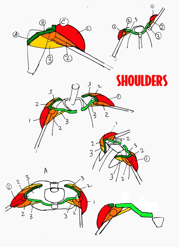
Visualizing the human form in three-dimensional space is one of the basic skills needed to make comics, and our bootcamp class makes this often difficult skill surprisingly easy, with a unique geometric approach to skeletal and muscular systems. In seven weeks, you’ll understand the movement of the elbows, shoulders, hips, knees and hands, basic human proportions, the muscle system, and balance (yes, in just seven weeks!) without needing a model to see it in your head. Previous drawing experience is not required, we can teach this method to anyone willing to learn.
Bring lots of paper and pencils, this is a class for drawing, not for listening to lectures.
***************************
HOW TO WRITE FOR COMICS PART TWO
LOCATION: 392 Spadina Avenue Second Floor, Toronto Ontario
DATES: WEDNESDAYS 7 – 10 pm May 9 – June 20 2018 (seven weeks)
FEES: $360 + HST (Payment accepted by cash, cheque, interac/email transfer or PayPal (There will be a fee for NSF cheques). Payment is due by the end of the first class.
Because class space is limited, if you find that your schedule/plans change and you are unable to attend the class, please let us know as soon as possible so that another student can attend.
PREREQUISITES: How To Write For Comics Part One or How To MAKE Comics
MATERIALS: bring what you need for taking notes; laptop, paper, pencils, pens, etc.
How To Write For Comics Part One grounds the student in the rules of plot, character, dialog, scripting and storytelling forms, we step up to a master class on practical writing. The students will learn the standard applications of tropes and genres, the rules of pacing and scene work, the secrets of world building, character bibles, supporting casts, sub-plots, comedy writing, ongoing series and much more.

Like all our workshops, we’ll be creating scripts and stories in class under a deadline. This time around, we’ll expect a complete short story about half way through, and by week seven students be pitching their own original series or graphic novel to the group. Bring your brains, and have no fear.

You’ll need something to write on, paper or laptops, whatever you prefer to use, as long as you can make it legible to fellow students.